


Waco Sandwich Shop Website Project: A Holistic Approach to Modern Web Design and User Experience
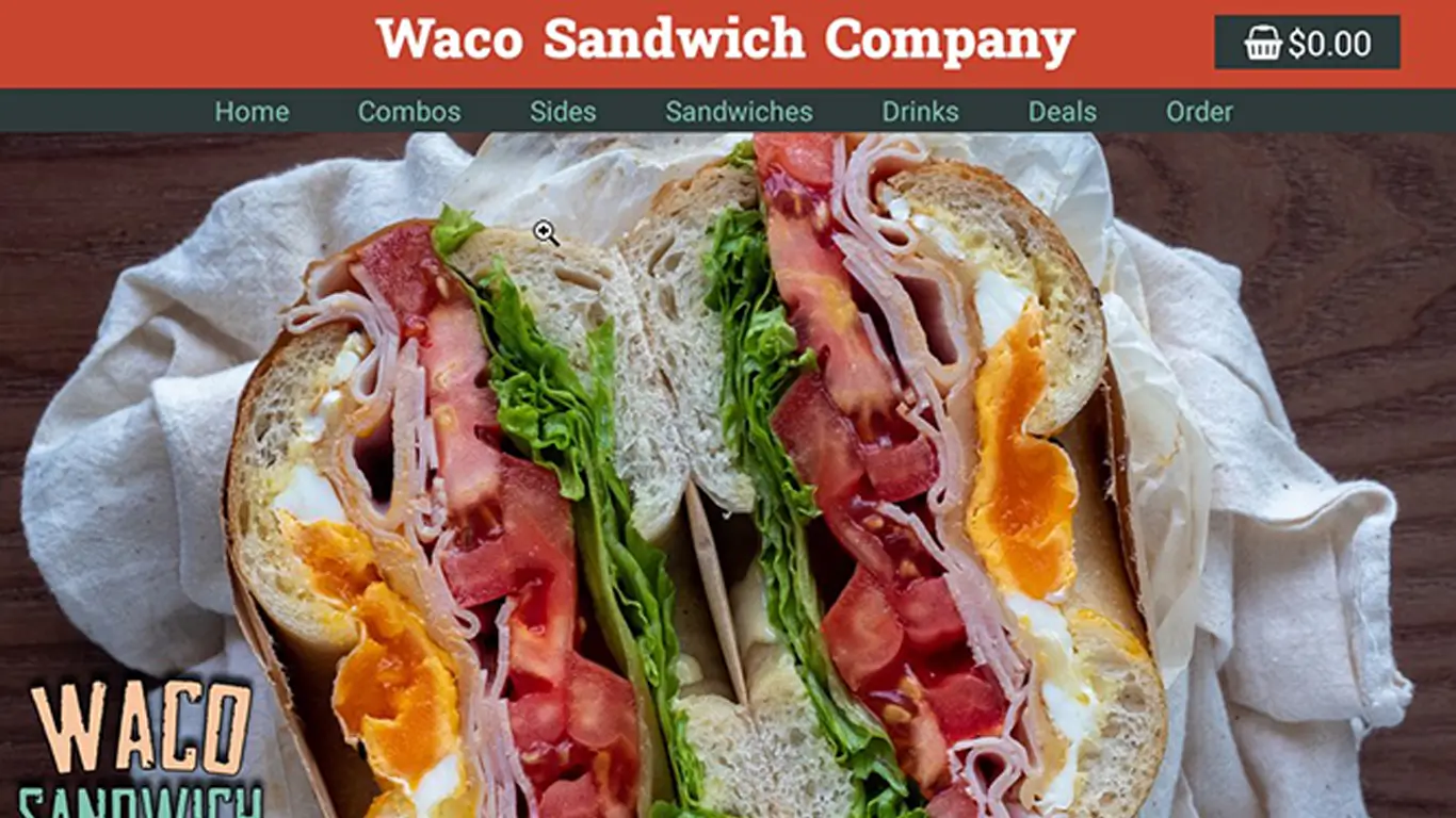
During my college years, one of the most impactful assignments in my Web Design course was the creation of a fully functional and visually compelling website for the Waco Sandwich Shop. This project was not merely an academic exercise but a comprehensive exploration of modern UI/UX principles, accessibility standards, and responsive design practices tailored for the food industry. It represented an opportunity to blend technical skills with creative problem-solving and thoughtful branding strategy.
Project Overview and Objectives
The primary goal of the Waco Sandwich Shop project was to design and develop a food-focused website that could effectively represent the brand online while providing an intuitive, enjoyable experience for users on both desktop and mobile devices. This dual emphasis highlighted two foundational pillars of contemporary web development:
-
Responsive Design: Ensuring that the website's layout, visuals, and interactive elements adapted seamlessly to a variety of screen sizes and device types.
-
Accessibility: Designing the site so it is inclusive and usable by people with a wide range of abilities, including those with visual impairments.
These goals drove every aspect of the project, from initial research and wireframing to final design and prototyping.
Responsive Design: Building for Every Screen
One of the most critical aspects of the Waco Sandwich Shop project was the creation of multiple versions optimized for different platforms. This meant the site had to function and look great whether accessed from a large desktop monitor, a tablet, or a smartphone.
Desktop Version
For desktop users, the website featured a clean, spacious layout that showcased the sandwich shop's offerings with high-quality imagery and clear navigation. Key considerations included:
- Grid-based layouts: Leveraging CSS grid and flexbox to organize content logically and visually pleasing.
- Hover effects: Enhancing interactivity through subtle animations triggered by mouse hover.
- Comprehensive menus: Offering detailed navigation with dropdowns and clearly visible call-to-action buttons.
Mobile Version
The mobile version was designed with touch interaction in mind, focusing on usability and accessibility. Special attention was paid to:
- Touch targets: Buttons and links were sized and spaced appropriately to prevent user frustration.
- Vertical stacking: Content that appeared side-by-side on desktop stacked vertically on smaller screens.
- Performance optimization: Images and scripts were optimized to minimize load times on mobile networks.
This multi-device approach ensured that regardless of how users accessed the website, their experience would remain smooth and engaging.
Accessibility: Designing for Inclusivity
The project went beyond visual appeal by integrating web accessibility principles, making the Waco Sandwich Shop site usable for a broader audience, including those with disabilities.
Color Contrast and Visual Hierarchy
One of the foundational steps was analyzing and choosing color combinations that met WCAG (Web Content Accessibility Guidelines) standards for contrast. This ensured:
- Text was legible against background colors.
- Important UI elements stood out for users with low vision.
- Color choices did not rely solely on color perception to convey information.
Keyboard Navigation and Screen Readers
In addition to color considerations, the design accounted for:
- Logical tab order: Enabling keyboard users to navigate menus, forms, and other interactive elements efficiently.
- ARIA attributes: Adding semantic tags to enhance compatibility with screen readers, aiding visually impaired users in understanding page structure and content.
Touch Area Optimization
Recognizing that mobile users interact differently, the project carefully sized touch areas, avoiding elements that were too small or too close together, preventing accidental taps and improving overall mobile usability.
Branding Through Design: Crafting a Visual Identity
A significant portion of the project was dedicated to using design as a tool for brand storytelling. The Waco Sandwich Shop needed a website that not only functioned well but visually communicated its personality and values.
Color Palette and Typography
The chosen colors reflected the warmth and inviting nature of a neighborhood sandwich shop, incorporating earthy tones and complementary accent colors. Typography was selected for readability and character, balancing friendly and professional vibes.
Imagery and Iconography
Custom icons and high-resolution photographs of sandwiches, ingredients, and shop interiors were integrated strategically to:
- Entice visitors visually.
- Support textual content with appealing visuals.
- Build a consistent thematic experience throughout the site.
Logo Placement and Visual Consistency
The logo was prominently displayed on the header and footer across all pages, reinforcing brand recognition. Design elements such as buttons, headings, and backgrounds followed a consistent style guide to unify the overall look.
Technical Approach and Tools
Though primarily a design project, the Waco Sandwich Shop website incorporated foundational web technologies and tools commonly used in the industry:
- Adobe Photoshop: For creating and optimizing visual assets.
- Responsive frameworks and media queries: To ensure layouts adapted fluidly to different devices.
- HTML5 and CSS3: The backbone of the site's structure and styling.
- Accessibility testing tools: To verify compliance with standards and improve user experience for all visitors.
The Design Process: From Concept to Final Prototype
Research and Planning
Before diving into design, I conducted thorough research into:
- Competitor food websites.
- User expectations for restaurant online experiences.
- Best practices in mobile responsiveness and accessibility.
This research informed wireframes and mood boards that guided the design direction.
Wireframing and Prototyping
Initial low-fidelity wireframes mapped out the site's architecture, focusing on navigation flow and content placement. These wireframes were then transformed into high-fidelity mockups showcasing detailed visual elements.
User Testing and Iteration
User feedback sessions were conducted to identify pain points, particularly around mobile navigation and readability. Iterative changes improved the final design's clarity and ease of use.
Educational Takeaways
The Waco Sandwich Shop project was a formative experience, teaching me several key lessons:
- The importance of responsive design in today's multi-device world.
- How accessibility principles are integral to good web design, not just add-ons.
- The value of brand-driven design that connects emotionally with users.
- Practical skills in balancing aesthetic appeal with functional usability.
Conclusion
The Waco Sandwich Shop website project was much more than a class assignment—it was an in-depth exploration of what it means to build a modern, inclusive, and user-centered website. By combining responsive design, accessibility best practices, and strong branding, I was able to create a digital experience that met both business goals and user needs.
This project exemplified the intersection of creativity and technical skill, highlighting the holistic nature of effective web design. It also laid a strong foundation for my continued growth in web development and design, preparing me for more complex and impactful projects in the future.