Elite Electric Products Website Expansion: A Strategic Rebrand Initiative
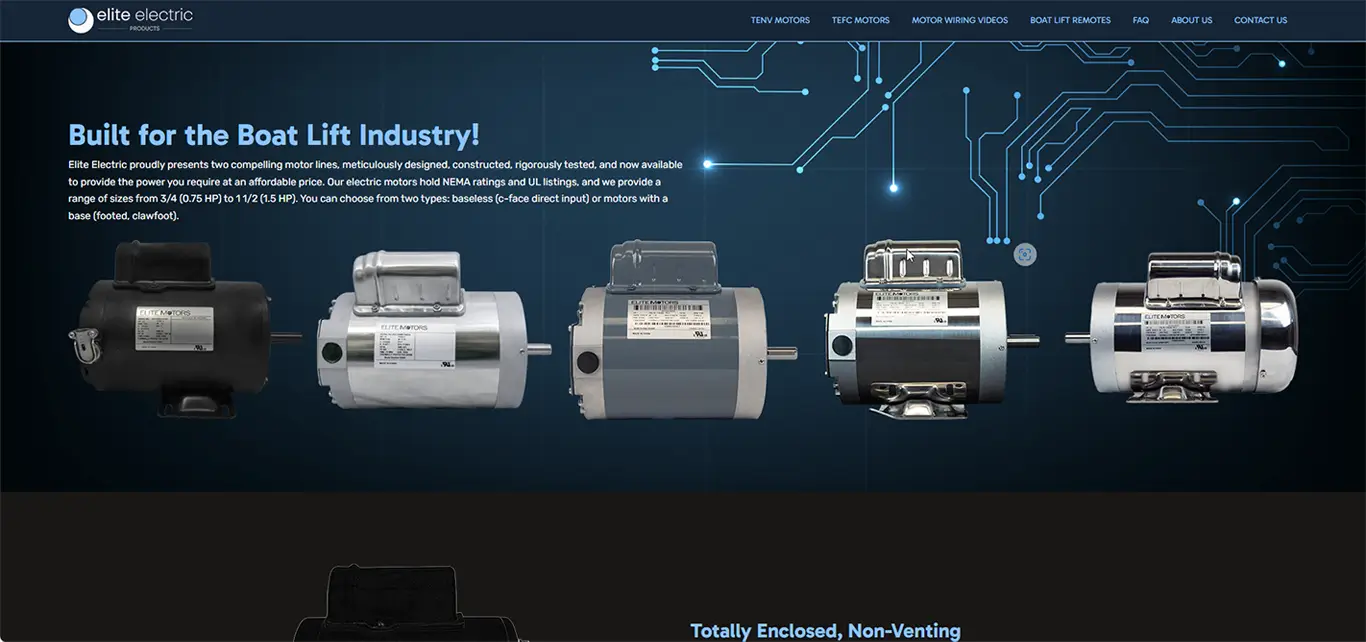
In a strategic move to diversify its offerings and extend its digital reach, Elite Electric Products embarked on a brand expansion in the fall of 2023, marking a key turning point in its evolution. As the lead designer and developer for this initiative, I spearheaded the complete redesign of the Elite website—transforming it from a niche product platform into a full-scale showcase of the company's broadened catalog and identity.
Objective: Modernization & Product Expansion
The overarching goal was to evolve the website into a modern, responsive, and visually engaging platform that could effectively communicate the newly expanded range of products beyond boat lift motors. The website had to reflect both the legacy of Elite Electric Products and its future-forward innovation.
To achieve this, I utilized the powerful and flexible Pro theme by Theme.co within the WordPress CMS, customizing layouts and interactive components to ensure performance, clarity, and scalability.
Key Technologies Used:
- WordPress + Pro Theme
- HTML5 / CSS3 for structure and styling
- JavaScript for interactivity
- PHP for backend templating and page rendering
- Adobe Photoshop and Illustrator for design assets
- Figma and Adobe XD for prototyping
- GitHub for version control and code backup
Design Approach: UI/UX, Branding, and Accessibility
The design phase focused on improving both user interface (UI) and user experience (UX). I was responsible for all page layouts, navigation design, iconography, and typography, using a mobile-first responsive design strategy.
UI/UX and Branding Highlights:
- Updated navigation architecture for intuitive user flow
- Mobile-friendly menu and accessible text hierarchy
- Redesigned product display sections to accommodate new categories
- Seamless visual integration of older product lines with new offerings
- Branding updates using custom logos, icon sets, and page templates
This refreshed branding was carefully crafted to appeal to a broad demographic, including existing loyal customers and new audiences exploring Elite Electric Products for the first time.
Image Development and Optimization
One of the standout challenges and achievements of the project was crafting and optimizing every image on the site. This included:
- Editing existing image assets from the legacy site
- Capturing and curating new product photos
- Cropping, color-correcting, and resizing in Adobe Photoshop
- Creating supporting graphics and illustrations in Adobe Illustrator
- Ensuring every image was properly compressed for fast loading
- Assigning relevant alt text and metadata for SEO and accessibility
By merging old and new imagery, I was able to create a cohesive, professional aesthetic that told a unified brand story while minimizing load times.
Content Strategy and SEO
I authored all on-site content from scratch, including home page messaging, product descriptions, support documentation, and metadata. Each content section was carefully optimized to ensure high search engine visibility and a smooth user reading experience.
Content Creation Highlights:
- Developed a consistent voice that reflects professionalism and innovation
- Integrated on-page SEO best practices like headers, internal links, meta tags
- Crafted CTAs that aligned with brand goals and customer pathways
- Structured support and FAQ content to reduce customer service queries
Technical Execution and Workflow
All development was first performed in a local MAMP environment, allowing for rapid iteration, testing, and debugging. Once the site reached stability, I pushed it live via GitHub deployment pipelines, ensuring version control, rollback capability, and continuous improvement.
Backend and Frontend Features:
- Customized theme components using PHP and JavaScript
- Configured forms with webhook-ready data routing for future CRM automation
- Designed fully responsive layouts to maintain usability across all devices
- Prepared the site for upcoming REST API integrations and e-commerce modules
Impact and Results
Since its launch, the site has successfully served as the digital face of the reimagined Elite Electric Products brand. It has seen:
- Significant increases in new product inquiries
- High retention times due to engaging content and user-friendly layouts
- Lower bounce rates thanks to faster load times and optimized media
- Positive client feedback regarding usability and mobile performance
Looking ahead, the site is fully prepared for scalability, including planned integration with WooCommerce and tools like Loftware NiceLabel for serialized product labels.
Keywords and Tech Highlights:
Core Technologies: WordPress, HTML5, CSS3, JavaScript, PHP, GitHub, Webhooks, REST APIs
Design Tools: Adobe Photoshop, Illustrator, InDesign, XD, Figma
Skills Showcased: UI/UX Design, Web Development, Image Optimization, SEO Content Writing, Responsive Layouts, Branding, Mobile Design
Conclusion
The 2023 relaunch of the Elite Electric Products website reflects not only a major brand milestone but also a full demonstration of my capabilities in full-stack web development, digital strategy, and creative direction. From local development to image optimization, from content creation to deployment, every aspect of this website was a direct result of hands-on execution and forward-thinking design.
This project reaffirms my belief that successful websites require a perfect synergy of technical skill, creative vision, and strategic execution—all of which were proudly brought together in this transformation of the Elite brand.
It'll Do Burgers: A Full-Stack College Project Combining UI/UX, Responsive Design, and Back-End Development
The It'll Do Burgers website project was a standout assignment during my college studies in 2023. It served as a culmination of everything I had learned up to that point about web development, responsive design, UI/UX principles, and visual branding. The project was created from scratch in a local environment and represented a comprehensive learning experience that ultimately contributed to me graduating with a 4.0 GPA.
Project Overview
This project was designed to simulate a real-world restaurant website. We were tasked with creating a fully responsive site that not only looked professional and user-friendly, but also incorporated a structured back-end and showcased creative graphic design. The It'll Do Burgers concept was fictitious, allowing creative freedom while maintaining the professional constraints of building for a real client.
This assignment emphasized the importance of clean design, intuitive navigation, and a seamless user experience across all devices. It wasn't just about functionality—it was about creating an engaging online presence for a local eatery that needed to stand out in a competitive digital landscape.
Technologies and Tools Used
The website was coded and tested locally, without using GitHub, as part of the classroom lab environment. All development was done on a personal local server setup.
Core Web Technologies:
- HTML5 – for structure and semantic layout
- CSS3 – for styling and responsive media queries
- JavaScript – to enhance interactivity and functionality
Adobe Creative Cloud Tools:
- Adobe Illustrator – for creating logos, icons, and branding visuals
- Adobe Photoshop – for editing food images, optimizing assets, and color correction
- Adobe XD – for prototyping and wireframing the site layout
- Adobe InDesign – for mock print materials like menus and posters
These tools were instrumental in elevating the final project with polished visuals, strong branding, and thoughtful user experience planning.
Design Process: From Concept to Completion
We started with a rough concept of what the restaurant brand should be. I developed wireframes in Adobe XD, mapping out the key pages of the site: homepage, menu, about us, contact, and order online sections. The branding centered around a quirky, casual burger joint feel—bold typography, a retro-inspired color palette, and mouthwatering food photography.
Key UI/UX Elements:
- Clear menu structure with bold CTAs
- Mobile-first responsive layout
- Balanced use of imagery and text
- Color contrast and font hierarchy to support accessibility
Each page was designed to feel part of a cohesive brand, using the same color schemes, textures, and visual elements. The fonts chosen were clean but bold, supporting both mobile readability and brand tone.
Back-End Simulation and Page Management
While we didn't build a full database-driven application, we simulated back-end concepts by building a structured file system and organizing content modularly. JavaScript was used to simulate dynamic content transitions between pages, and I employed vanilla JS methods to:
- Toggle menus
- Display modal windows (for location info or featured burgers)
- Implement form validations (contact forms/order forms)
The goal was to create a restaurant website that not only looked the part but felt responsive and alive—enhancing the customer experience as much as possible within the project scope.
Image Optimization
I sourced high-quality stock photography for the burger images and processed each one for web optimization:
- Resized for mobile and desktop breakpoints
- Compressed using Photoshop's Save for Web settings
- Applied alt-text and captions for accessibility
The optimized images helped reduce page load times and contributed positively to simulated SEO performance, which was part of the grading rubric.
Accessibility and Responsiveness
We were graded heavily on how well the site performed across devices. To meet these criteria, I built mobile-first using CSS3 media queries. I ensured:
- Text was legible on all devices
- Images resized fluidly and preserved aspect ratio
- Navigation was usable via touch and keyboard inputs
Color contrast was checked using web tools to ensure compliance with WCAG accessibility guidelines.
Challenges and Solutions
Challenge 1: Menu Organization
Burgers, sides, drinks, and combos needed to be displayed clearly. I used a tabbed interface built in JavaScript to allow users to switch between categories quickly without scrolling.
Challenge 2: Form Layout and Validation
Contact and order forms needed to be both functional and stylistically consistent. JavaScript was used for client-side validation, with visual feedback provided for input errors.
Challenge 3: File Organization
To mimic back-end architecture, I created a modular file structure with separate folders for images, CSS, JS, and HTML partials. This helped maintain organization as the project scaled.
Outcome and Academic Achievement
The project received an A grade and was a defining piece of my college portfolio. The professor praised its strong branding, clean code, responsiveness, and clear attention to user experience. It played a key role in maintaining my 4.0 GPA and validating my capabilities in both front-end design and entry-level back-end concepts.
Keywords and Skills Showcased
- Responsive Web Design
- UI/UX Design
- JavaScript Interactivity
- Image Optimization
- Accessibility Best Practices
- Adobe Creative Cloud Workflow
- Web Performance Optimization
Final Thoughts
The It'll Do Burgers project was more than a school assignment—it was a complete immersion into what it takes to build a responsive, user-centered website from scratch. It allowed me to practice:
- Applying real-world design tools
- Creating engaging user journeys
- Writing maintainable, semantic code
- Optimizing assets and navigation for performance
This experience laid the groundwork for many of the professional projects I would take on later in my career. It was a critical step in transforming classroom concepts into real-world-ready skills—and I look back on it as one of the most fun and impactful projects I've completed.
Building the Jaxon Jewelry Website: A Comprehensive PHP Programming Capstone Project
During my PHP Programming course in college, the creation of the Jaxon Jewelry website served as the defining final project and a comprehensive practical application of everything I had learned throughout the semester. This project not only solidified my understanding of PHP as a powerful server-side scripting language but also gave me firsthand experience in integrating multiple web technologies to develop a dynamic, interactive, and visually compelling website from scratch.
The project was designed to encapsulate the full spectrum of web development skills — from client-side interface design and server-side scripting to database management and user experience optimization. It was a deep dive into the capabilities of PHP and related web technologies, emphasizing how a cohesive website can be constructed by managing the flow of data between the client browser, server scripts, and databases.
Project Overview: A Multi-Page PHP Website for Jaxon Jewelry
The primary objective of the project was to design and implement a multi-page website for a fictional jewelry brand called Jaxon Jewelry. The brand's identity was crafted with elegance and sophistication in mind, reflecting the exquisite nature of the jewelry pieces featured. The website needed to embody these branding elements visually while providing an intuitive, smooth user experience.
Core Functionalities
-
Multi-page navigation: Users could easily navigate between product categories, detailed item pages, contact forms, and informational sections without interruption.
-
Dynamic content loading: Using PHP scripts, product details were fetched dynamically from SQL databases and JSON data files.
-
Interactive forms: Visitors could submit inquiries and orders through multiple forms, with backend validation and processing.
-
Database integration: Product inventories, user submissions, and customer information were managed using SQL databases to simulate real-world data management.
-
Brand identity through design: The site's color palette, typography, and graphic elements reflected Jaxon Jewelry's luxurious and trustworthy brand image.
Technical Foundations: PHP and Server-Side Development
PHP (Hypertext Preprocessor) was the backbone of this project — a versatile server-side scripting language designed to generate dynamic web pages. Throughout the course, I had explored PHP's syntax, control structures, functions, and built-in server communication methods. For this final project, I applied this knowledge comprehensively.
Navigating Between PHP Files
One of the challenges involved structuring the website so that each page was a separate PHP file, interconnected through hyperlinks and form submissions. This required a solid understanding of how PHP scripts execute on the server and deliver HTML content to the browser.
I implemented navigation menus and footer elements that were modularized through PHP includes, allowing for code reusability and consistent layouts across pages. This approach not only streamlined the development process but also reinforced best practices in maintaining scalable and maintainable codebases.
Data Management: SQL Databases and JSON Integration
Managing and displaying product data was a fundamental part of the website's functionality. To achieve this, I utilized two key data storage formats: SQL databases and JSON files.
SQL Database Use
An SQL database was designed to hold the core product catalog — storing information such as product IDs, names, descriptions, prices, stock levels, and image file paths. Through PHP's mysqli extension, I created secure database connections, executed queries, and retrieved data to populate product listing pages and detail views dynamically.
This dynamic data retrieval allowed the website to stay up to date with product information without requiring manual HTML changes, reflecting real-world e-commerce site practices.
JSON Files for Supplementary Data
In addition to the SQL database, I integrated JSON files to store supplementary data such as customer testimonials, jewelry care tips, and promotional banner content. These JSON files were parsed with PHP's native json_decode() function, enabling easy iteration over arrays and objects to inject this content dynamically into the page templates.
Using JSON files offered a lightweight method to manage non-relational data, which enhanced the site's flexibility without overcomplicating the backend architecture.
Interactive Forms and User Input Handling
The Jaxon Jewelry website featured several forms — including contact requests, newsletter sign-ups, and product inquiry submissions — which required careful validation and processing to ensure security and reliability.
Client and Server-Side Validation
To enhance user experience and data integrity, I implemented both client-side validation with JavaScript and server-side validation with PHP. This dual-layer approach prevented incorrect or malicious data from entering the system.
For example, email fields were validated for proper format, required fields were checked for completeness, and inputs were sanitized to prevent SQL injection and cross-site scripting (XSS) attacks.
Data Handling and Feedback
Form submissions were processed on the server using PHP scripts that validated inputs, saved data to the SQL database, and sent notification emails to the site administrator. Users received immediate feedback via confirmation pages or inline messages, fostering trust and engagement.
Graphic Design and Branding: Crafting a Cohesive Aesthetic
Beyond the code, a strong emphasis was placed on the visual design and brand representation of the website.
Color Palette and Typography
Drawing inspiration from luxury jewelry brands, I selected a color palette featuring deep golds, elegant blacks, and crisp whites. Typography choices favored serif fonts for headlines, exuding sophistication, paired with sans-serif body text for readability.
Logo and Iconography
The Jaxon Jewelry logo was designed using Adobe Illustrator, leveraging vector graphics for scalability and crispness across devices. Custom icons representing different jewelry types (rings, necklaces, bracelets) were created to visually enhance navigation and product categorization.
Image Editing and Optimization
High-resolution jewelry images were carefully edited in Adobe Photoshop — adjusted for color accuracy, shadows, and highlights to best represent the products online. Images were optimized for web using compression techniques to ensure fast page load speeds without sacrificing quality.
User Experience (UX) Design Considerations
Creating a seamless and engaging user experience was critical to the website's success.
Responsive Design
Although PHP is server-side, the frontend was developed with a mobile-first mindset. HTML5 and CSS3 media queries were utilized to ensure that the website rendered beautifully on various screen sizes — from smartphones to desktops. Navigation menus adapted to smaller screens via dropdown toggles, and images scaled fluidly.
Accessibility
Attention was given to accessibility, including proper use of semantic HTML5 elements, alt text for images, sufficient color contrast, and keyboard navigability. These efforts made the site usable for a wider audience, including users with disabilities.
Challenges and Problem-Solving
Building a dynamic website from scratch with multiple interconnected technologies inevitably presented challenges that tested my problem-solving skills.
Managing State and Navigation
Keeping track of user interactions and navigating between pages required implementing PHP sessions to manage temporary user data, such as cart contents or form progress.
Debugging and Testing
Errors ranging from syntax mistakes to logic flaws were identified and resolved using a combination of error reporting, print debugging, and browser developer tools. Testing across browsers ensured compatibility and consistent performance.
Learning Outcomes and Skills Developed
This project was a milestone in my development as a web programmer and designer. It provided invaluable experience in:
- Applying PHP for real-world dynamic site creation
- Structuring SQL databases and writing efficient queries
- Working with JSON data for flexible content management
- Integrating graphic design into functional web pages
- Implementing secure and user-friendly forms
- Managing responsive and accessible frontend design
- Practicing debugging and iterative development
Conclusion: A Holistic PHP Web Development Experience
The Jaxon Jewelry website project was more than just a college assignment — it was a full-scale simulation of professional web development. By combining server-side PHP programming with client-side design and database management, I was able to produce a website that was not only functional and interactive but also elegant and brand-consistent.
This comprehensive project solidified my understanding of how the various layers of modern web development come together. It highlighted the importance of seamless page transitions, dynamic content management, and the blend of technical expertise with creative design. As I continue to grow as a developer, the lessons learned during this project remain foundational, preparing me to build sophisticated, user-centric web applications in future endeavors.